Tosca line up, a Soubry brand

Tosca, a Soubry brand for everyone

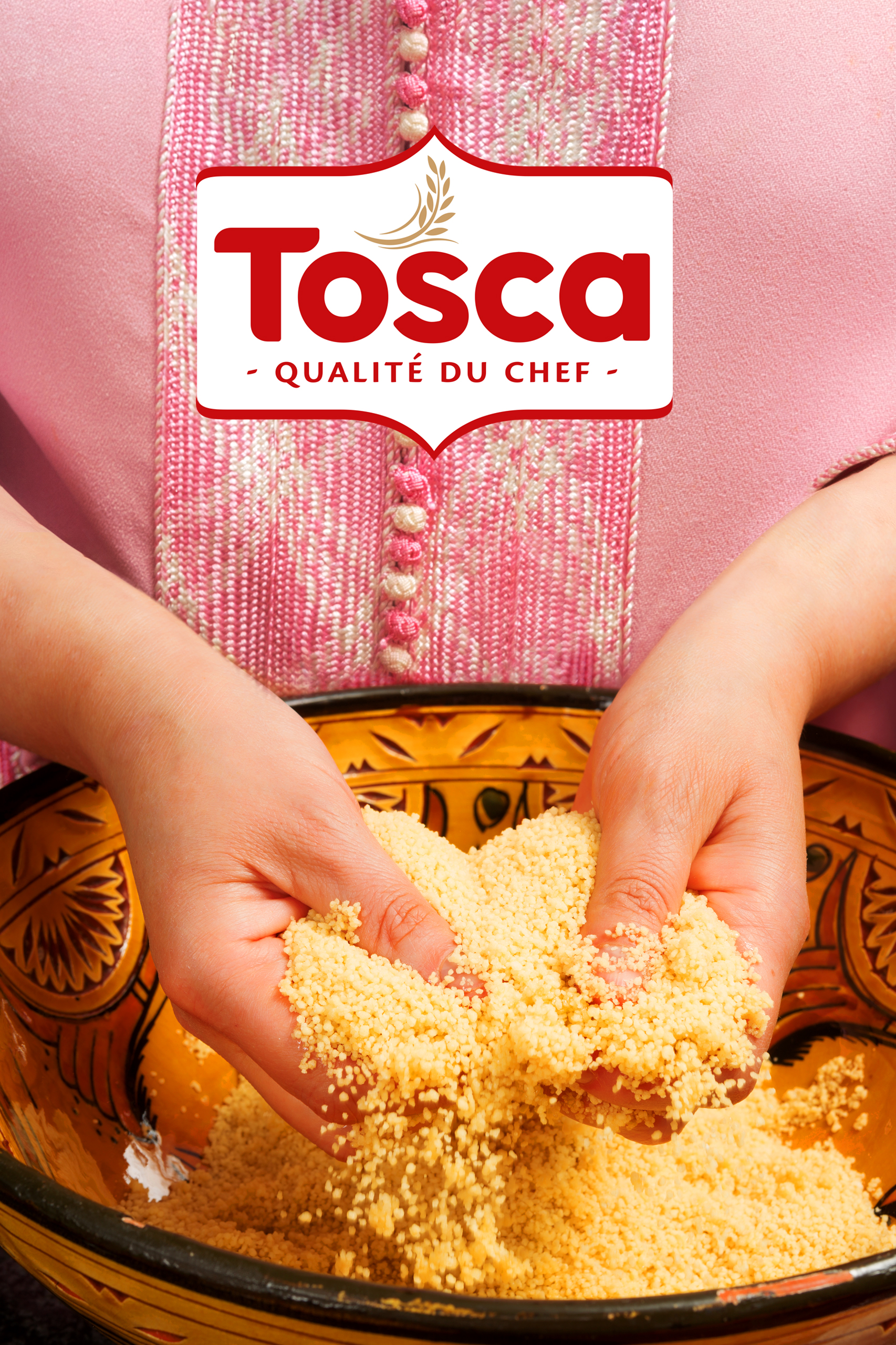
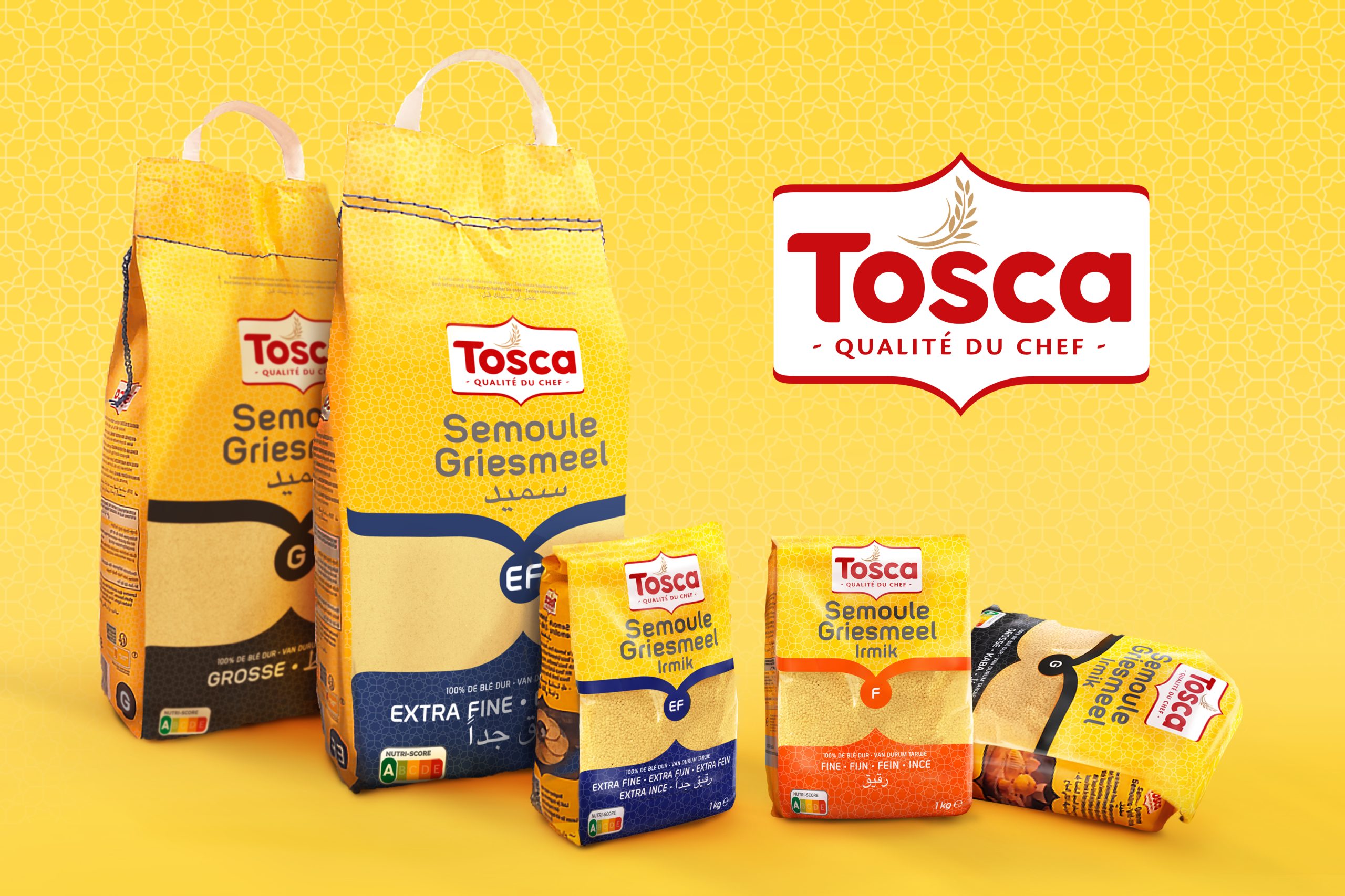
Tosca is a brand of the Belgian family business Soubry. The popular Belgian heritage brand Soubry wants to respond better to the needs of an increasingly diverse society. Tosca is the perfect brand to facilitate this ambition.

Over the years, Tosca’s vermicelli has become an iconic product among ethnic consumers and enjoys an excellent reputation for quality and taste. Soubry wants to take full advantage of this success and build further on it. Soubry aims to make Tosca a full-fledged inclusive and contemporary brand with a wide and more comprehensive offer that meets the daily need for qualitative ingredients to create delicious and nutritious meals.

We feel honored that Soubry contacted Designrepublic to collaborate on this mission.

What we did

Categories

naming / branding / packaging design / graphic design / POS / artworking / art direction

Tosca recipies
Tosca recipies

PORTFOLIO & RANGE CONSISTENCY:

Alongside the widely praised vermicelli, several variants of semolina are housed under the brand. Also different types of pasta would be included in the future – think of pasta types that go beyond the typical Italian variants, such as orzo.

Our assignment was to build a clear, consistent and comprehensive brand architecture. We introduced a consistent color coding and benefit communication system to ensure that product differentiation is clear in one single glance. For semolina, there are 3 different grain sizes. The grain size is an extremely important product feature because each grain size has its own applications in ethnic cuisine. We therefore assigned an individual color code and letter code for each grain size to ensure a clear differentiation. A transparent window ensures extra clarity on the product content.

LOGO & DESIGN ARCHITECTURE

The logo was to remain recognizable and needed an uplift to make it more contemporary. There was, however, slightly more needed than just a simple polish-up. We decided to inject a subtle
arabic touch and we placed ‘Tosca’ in a holder shape with pointed curves, inspired on Islamic architecture. The curves are repeated further down in the design and function as a holder for the
window showing the product inside. The grain illustration and ‘Quality du chef’ claim are part of the logo and work as an extra endorser of quality.

INSPIRATIONAL RECIPES

Tosca needs to be attractive and inspiring to the wider public. We therefore integrated mouth-watering, inspirational photography of typical dishes with a QR code that guides the consumer towards the recipe.