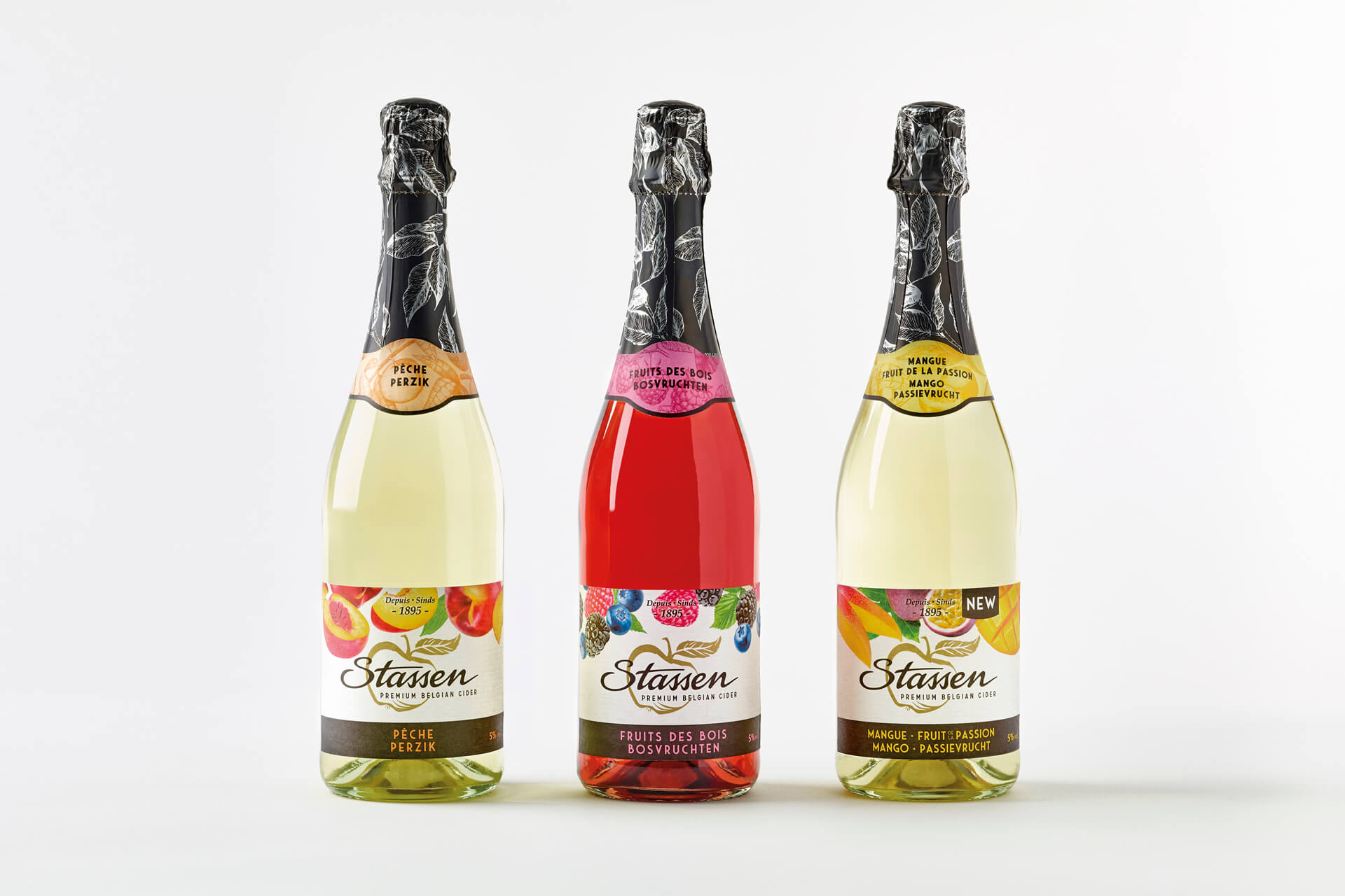
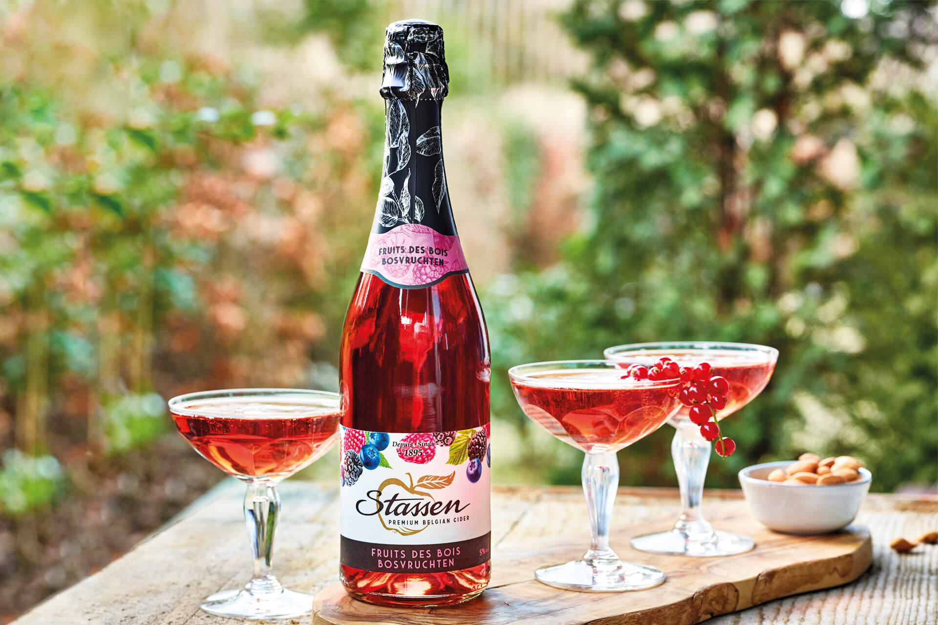
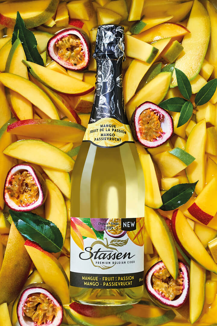
Stassen’s fruit ciders are all about fruitiness, a festive fresh & fruity family aperitif.
When we were approached to redesign the Stassen bottle label, the main objectives were to express fruitiness, to make the design more up-to-date and stay accessible for a wide range of customers.
Using vibrant photography of the flavoring ingredient(s) was our first step to express an appealing fruitiness. And what better way than to integrate white into the design to add freshness? By placing the Stassen logo horizontally, we made sure that existing customers would find their brand back easily after our redesign. To make the bottle even more fruity, we used a color coding on the bottle neck labels.
The result is a fruity cider design for everyone’s taste and a fruitful design for Stassen. This packaging is featured on the leading packaging design blog ‘Packaging of the world’.