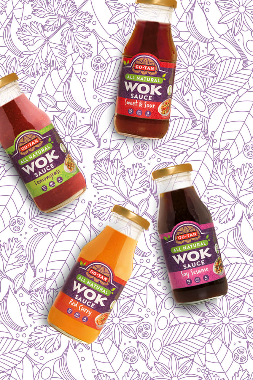
Go-Tan is a Dutch based family business, specialized in Indonesian food. Over the years, DesignRepublic has been designing the crisp range, the noodle range and relifting the famous Wok sauces for the Dutch and international market.
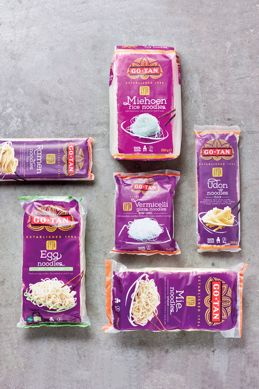
For the noodle range we based the design on the brand’s purple heritage color. We used a hand painted background to accentuate authenticity. This makes the packaging even more ownable but just to be sure we even redesigned the typography of the titles on packaging. To emphasize the easy, creative aspect of cooking Asian food, we choose to show plain cooked noodles in a suggestive bowl or plate. The rest is up to you.
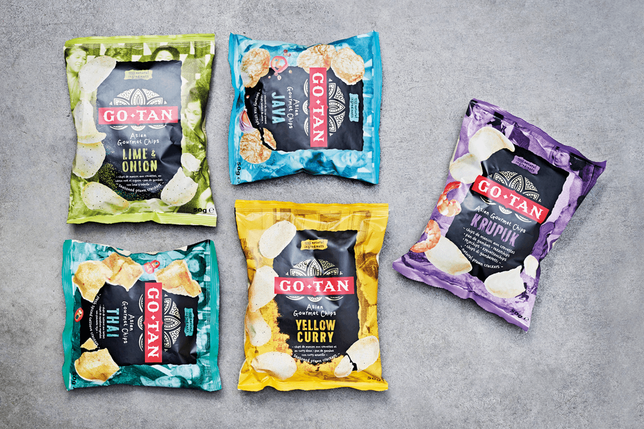
For the crisp designs we used appetiteful snacking codes against old pictures from the food loving Go-Tan family album. To have impact and to make sure the brand stands out in the shelves we used a black supporting device.
The result is an authentic, accessible design from the food loving family Go-Tan.
