CALUWAERTS UYTTERHOEVEN Lawyers Let’s get things clear / Corporate identity & baseline creation by DesignRepublic Belgium

CALUWAERTS UYTTERHOEVEN
Let’s get things clear / Corporate identity & baseline creation

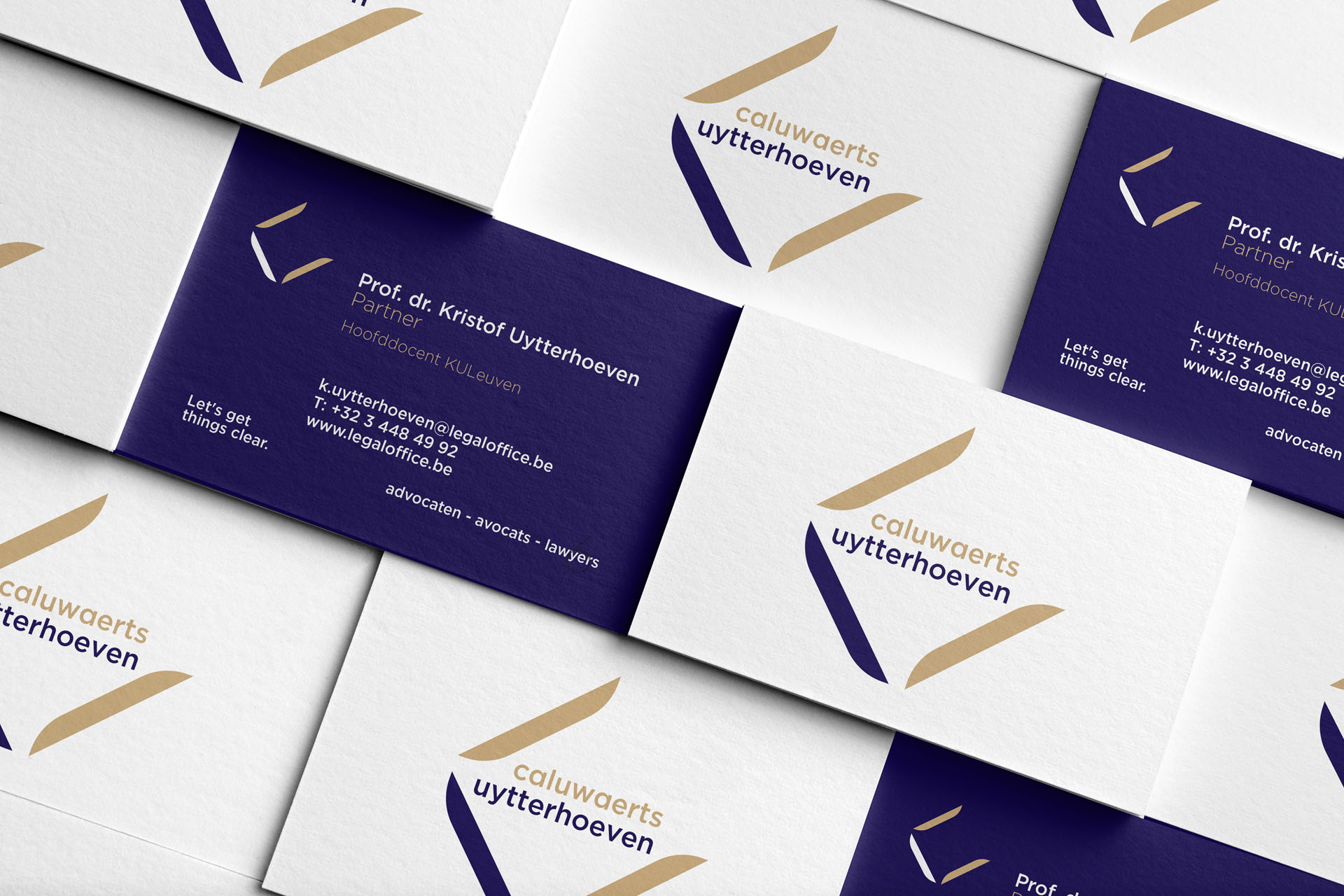
Caluwaerts Uytterhoeven is a law firm based in Antwerp and part of LawExchange Int. We were hired to create a visual identity that reflects the positioning and the people at Caluwaerts Uytterhoeven: powerful, self-assured and rational.

We’ve created an icon that not only incorporates these 3 words but also represents the first letters of Caluwaerts Uytterhoeven in a graphic way. The open diamond shape stands for the ‘C’ and the ‘U’. Doing so, we were able to avoid that people would read the icon as ‘CU’, a word play that was obvious and that our client wished to avoid and so we did.

We came up with the baseline ‘Let’s get things clear’ and it has become the motto of the firm.

What we did

Categories

rebranding / brand claims / art direction / print design / market analysis / artworking / brochure design / logo design / corporate identity / webdesign / baseline

CALUWAERTS UYTTERHOEVEN Lawyers Let’s get things clear / Corporate identity & baseline creation by DesignRepublic Belgium