BIGH Truite Saumonée creation de l'emballage par DesignRepublic

BIGH Aquaponic Farm
Branding & Packaging Design

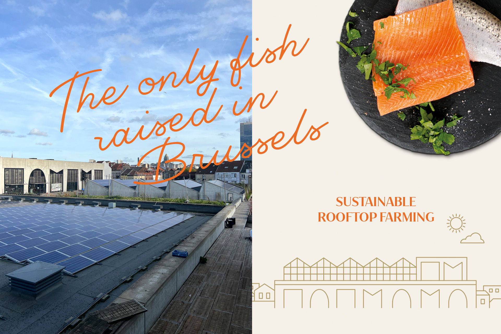
Brussels ‘trouts’. No, this isn’t a typo.

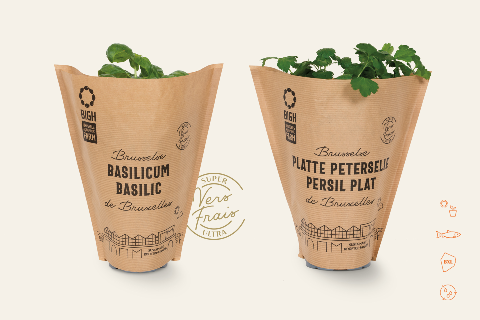
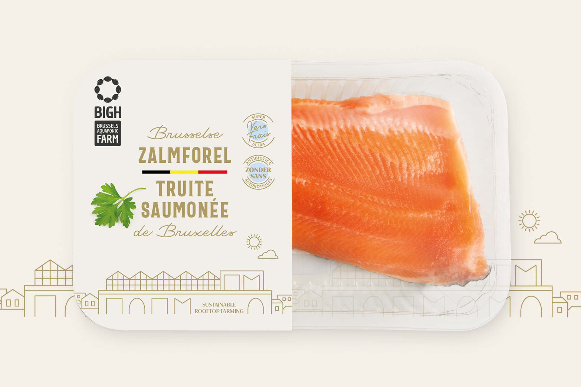
BIGH (Building Integrated GreenHouses) is the brainchild of architect and founder Steven Beckers. BIGH Farm Abattoir is located in the heart of Brussels, on the roof of the Foodmet hall market at the Abattoir site in Anderlecht. The urban farm is taking sustainability to a next level as all activities are powered by heat emitted from the building, rooftop rainwater and other water sources and solar energy.  At the farm they grow trout, herbs, tomatoes and other vegetables with an aquaponic system. All products are 100% local and 100% chemical-free!

We were approached by BIGH to create a packaging design that clearly reflects the philosophy and sustainable nature of the company: circular production processes, pure and qualitative locally grown products.

What we did

Categories

packaging design / graphic design  / artworking / illustration / photography

BIGH Branding by DesignRepublic

We were briefed to create a design that radiates a certain class, while remaining accessible to the larger public. We were asked to create a design for the herbs range and the fish range. The challenge here was to ensure coherence cross-range bearing in mind that the herbs is a range that is bought by a large public, whereas the fish range is somewhat more premium. When starting the design process we instantly felt the urge to tell the amazing story of BIGH and there is no better way than to do this through a drawing of the skyline of the rooftop itself. The illustration style we used is modern, pure and iconic and is present on both product ranges as an ownable and iconic feature cross-range. For the product name we selected a contemporary, straight typography. We chose a modern handwritten font for the origin ‘Brussels’ to emphasize the local nature of the brand and products.

The craft paper of the fresh herbs creates and extra dimension to the ‘fresh from the market’ feeling. For the fish range we deliberately chose to bring the design to a somewhat more premium level by adding gold for text and illustration and by integrating an origin reference through colour coding of the Belgian flag.

BIGH fresh herbs branding by DesignRepublic