Paturain rejuvenation

PATURAIN
Rejuvenating an iconic brand for Holland
Branding & Packaging Design

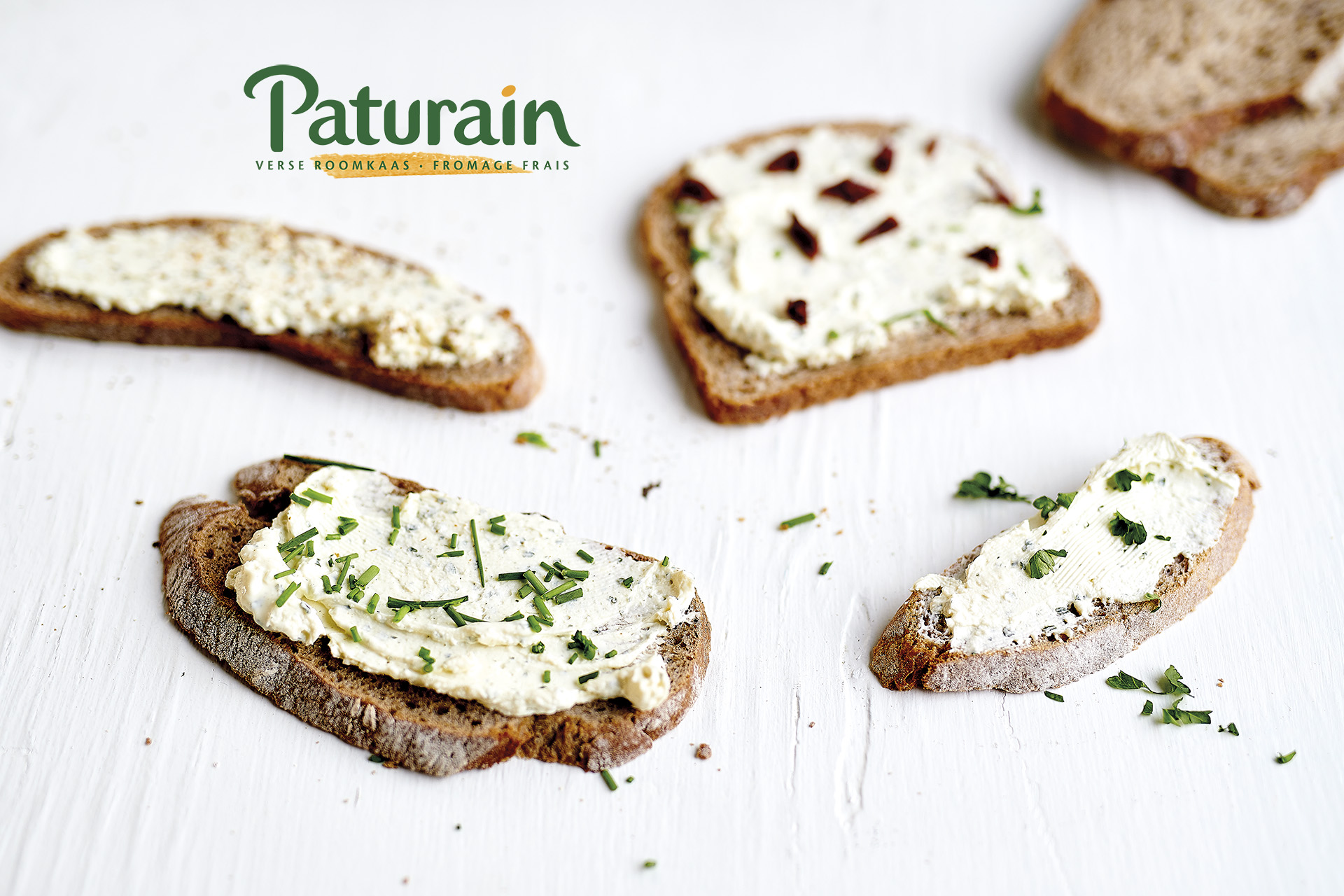
Over the years, Paturain has become a well established brand in the Netherlands. To support that positioning the brand’s look & feel had to be in line with the time spirit whilst respecting the brand’s heritage.

Our main strategy was to go back to the essence of the brand: a natural product with fresh ingredients.

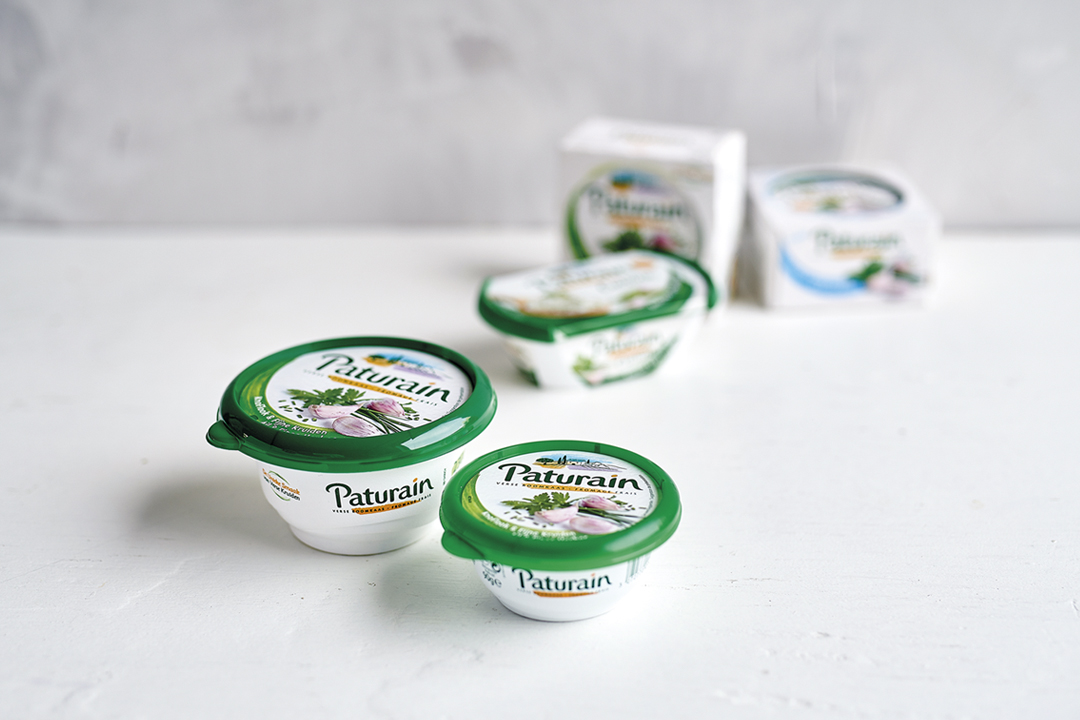
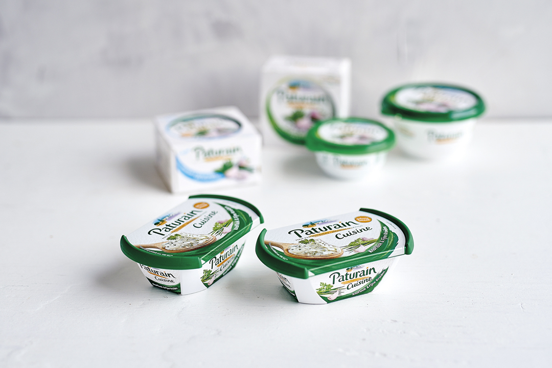
We kept the brand’s main design equities: green & orange logo type, an iconic visual refering to the Provence in France and lots of white refering to the freshness of the product. Next to that, we left out all the unnecessary elements to make the main design equities stand out even more. Also, we redesigned the logo and introduced a colour variant system that is more up to date and supports the French character of the brand.

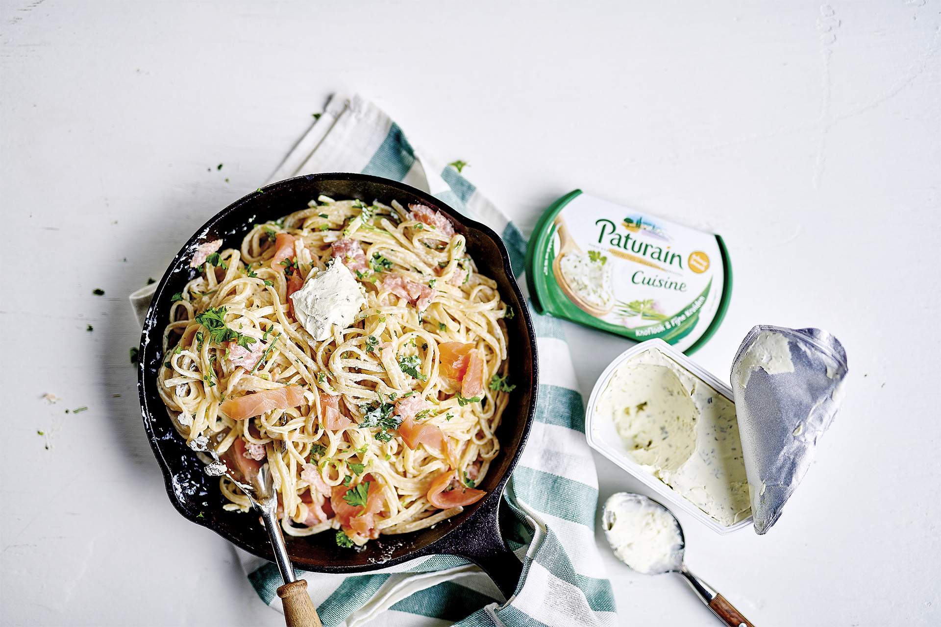
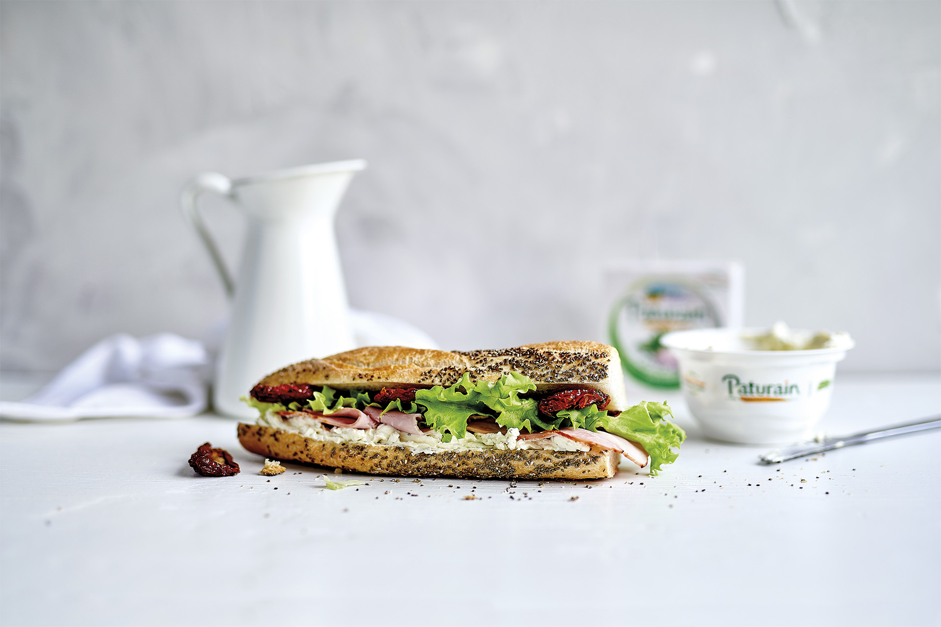
Paturain, enjoy naturalness.

What we did

Categories

packaging design / branding / art direction / graphic design / brand design / illustration / artworking

PATURAIN Rejuvenating an iconic brand for the Netherlands / Branding & Packaging Design by DesignRepublic Belgium